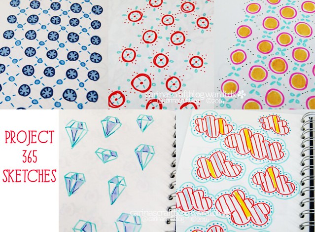
Maybe you remember my Project 365 in 2014? Where I was supposed to draw a repeat pattern in my sketchbook every day. Or atleast end up with 365 pattern sketches. Well, I managed to do around 140 sketches. So the project was a failure. From a certain point of view.
But I don’t think it was, because I’ve learnt a few things about how I like to work, and that’s more important to me than an arbitrary number of sketches. For example: as much as I like the idea of doing sketches like that with acrylic paint or watercolours – the materials that work best for me is using colourful markers. They dry instantly so I can move right on to the next sketch – speed is of the essence when you have 5 ideas sprouting from one idea. And the colours are bright and happy.
Another reason the project isn’t a failure: I turned a handful of the sketches into fabric designs. And just before Christmas I got my samples, yay! They are all available in my Spoonflower shop.
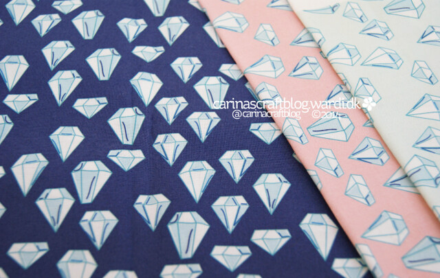
The first design I’ve called Sketch Gems – because I kept a hand drawn feel to it. I have done it with 3 different background colours, Midnight, Light Pink and Light Blue. I ordered a fat quarter of the Midnight gems for myself.. not sure what I’m going to make with it yet. Maybe I will use it with all the new swatches along with some solids to make a lap quilt or something…
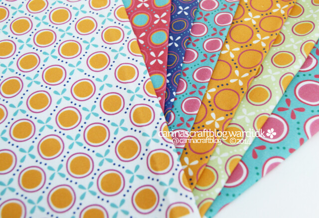
This design is called Nonna’s Kitchen. When I saw them printed on fabric I thought the colours had a sort of vintage country kitchen feel to them. I’m not Italian, but I’ve seen kitchens and pottery in Italy with this sort of colours going on, so I think I can get away with the name ‘Nonna’ which means grandmother in Italian… ;-)
I had so much fun playing with the colours, letting random selections guide me. It’s amazing how different they are, just by changing the colours. I think they go quite well together. :-)
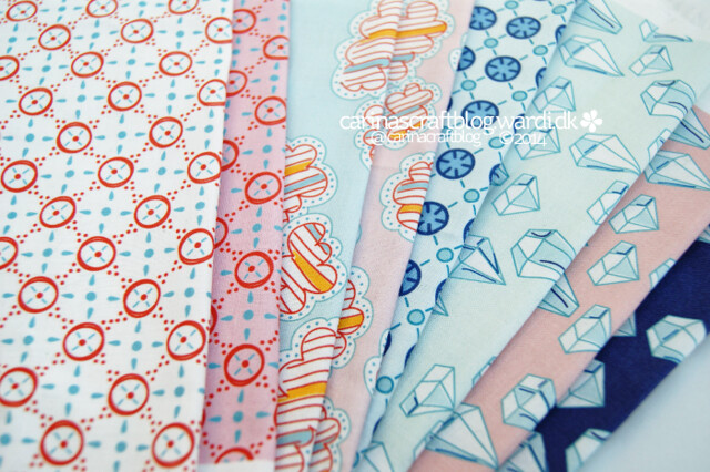
Maybe I should just put all these designs in one collection called ‘Sketchy’. In this design, Red Circle Tile, I also wanted it to feel quite loose, like it has come straight from my sketch onto fabric. So the red circles are not aligned. The other elements don’t line up perfectly either. Of course, you only notice it if you look at it closely. White and Light Pink background colours.
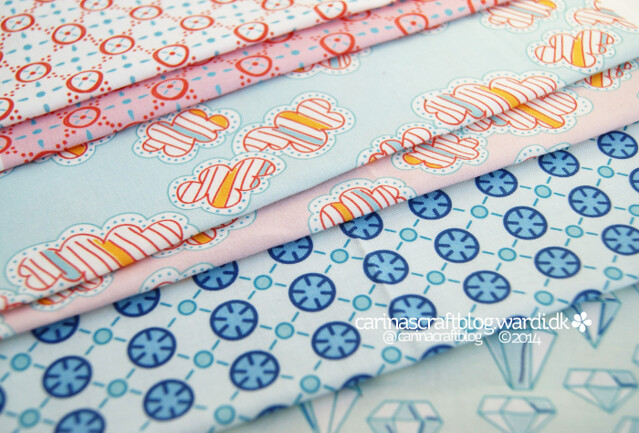
Stripy Clouds! Of course I had to do some clouds. I love clouds. And I really liked the looseness of the clouds in the sketch, so I tried to keep that in the fabric design. It’s not entirely the same when you draw it in vector, but you can get fairly close.
The last design, Mini Tiles. This is the properly aligned of the lot. I think it had to be or the straight lines not lining up would drive you crazy. Or at least drive me crazy. Although, they are not perfectly aligned. I am perfectly ok with that. :-)