Another textile picture inspired by our New York trip. And not the last one, I’m sure! I have no concrete plans right now, but there are some ideas bubbling away…
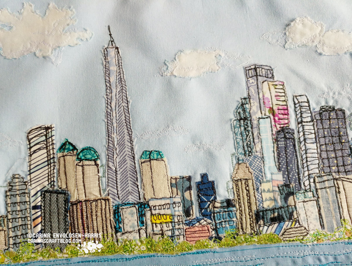
This is the Manhattan skyline seen from Liberty Island. I had a goal to do lots of sketching on the trip but we were rushing around and often I was too tired to do as many as I’d hoped. Or more concerned about cooling down in the heat!
Anyway, I did take a few moments to do a sketch of the Manhattan skyline and I’m glad I did because it became the inspiration for this textile picture. And sketching helps capture memories too. Not just on paper, but in my mind. I can clearly remember sitting there, looking across the water. Quietly sketching while all the other tourists were milling about, taking pictures.
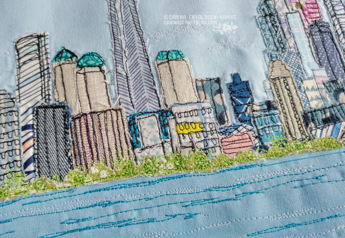
I had a pretty clear idea of what I wanted to do with the buildings but I didn’t know what to do about the water. I thought about adding scraps of fabric to give it a bit of texture but in the end I just settled on wonky lines in two different blue colours to give a sense of waves. I think keeping it simple was best, so the water didn’t take attention away from the buildings.
At first I didn’t like how the water fabric didn’t want to lay completely flat, I tried pressing it a couple of times. But now I think maybe it actually makes the water seem more ‘alive’. See the top photo where you get the whole effect.
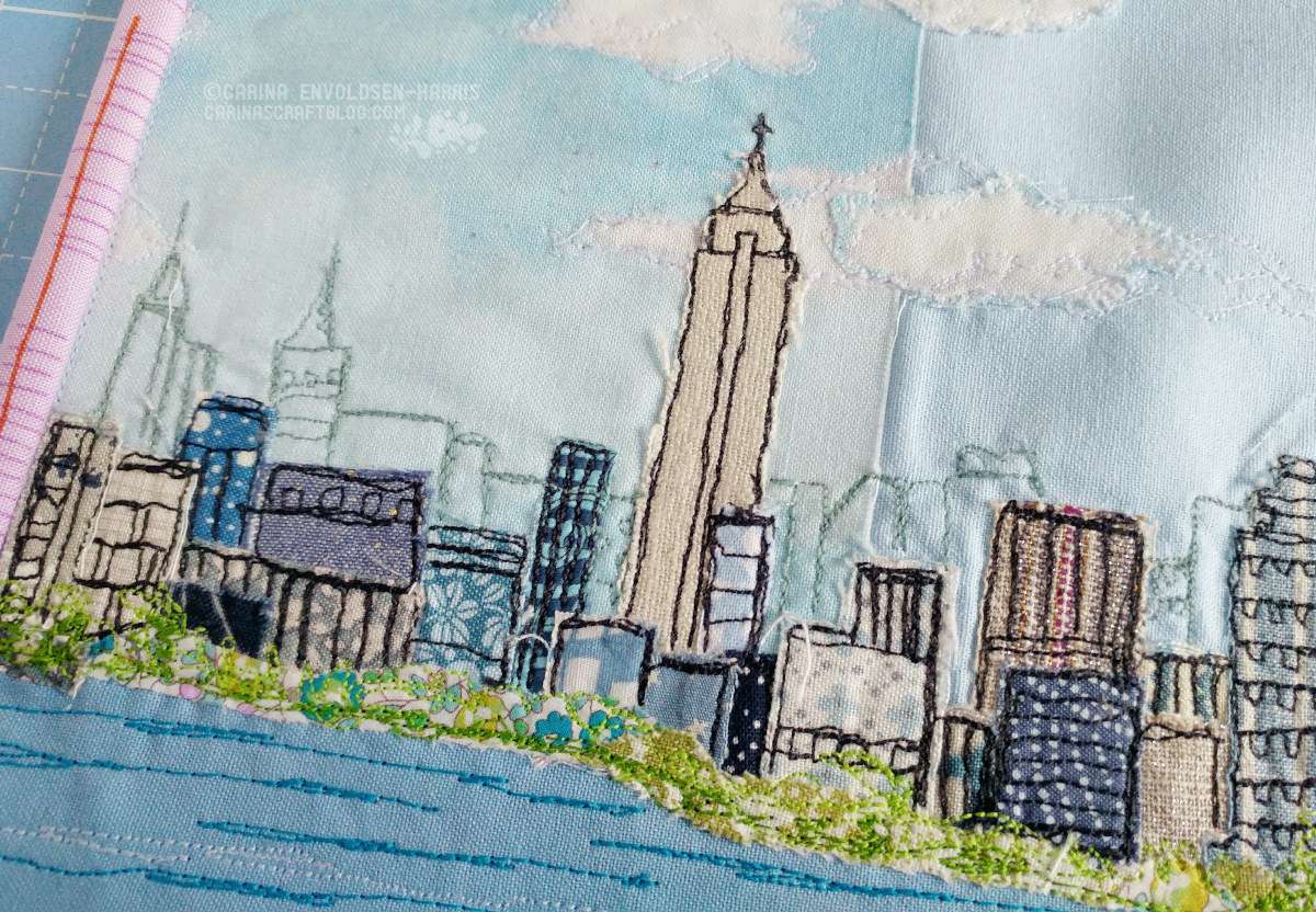
The Empire State building seemed so small in the distance! I think I may have exaggerated its size just a little bit. ;-)
It was quite fiddly to add all the little fabric scraps for the buildings. I used hemming web, but I think next time I might just use a glue stick. It was a close call with the iron a few times!
The fiddly-ness is also the reason for the background buildings of Midtown just being machine stitched without appliqué. It was just too fiddly with layer upon layer upon layer. But I think I prefer the outline effect anyway. Makes it seem more in the distance than it would have if I had added fabric to it.
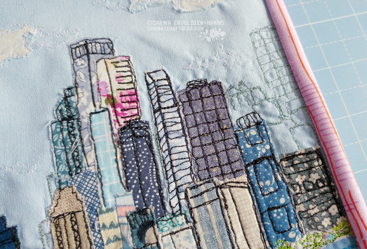
I think this little section here is my favourite. It may be because of that little bit of pink in one of the buildings. It’s a nice contrast to all the blue, grey and taupe.
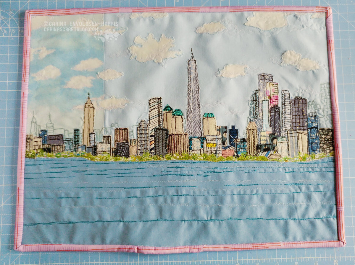
Contrast is also the reason I used the pink and orange fabric for the binding. I auditioned several different fabrics but I think this is the perfect one. It is a contrast to the picture but not so much it takes away from it. And it has those lines that kinda echo the lines of the buildings. I’m happy I had it in my stash! :-)
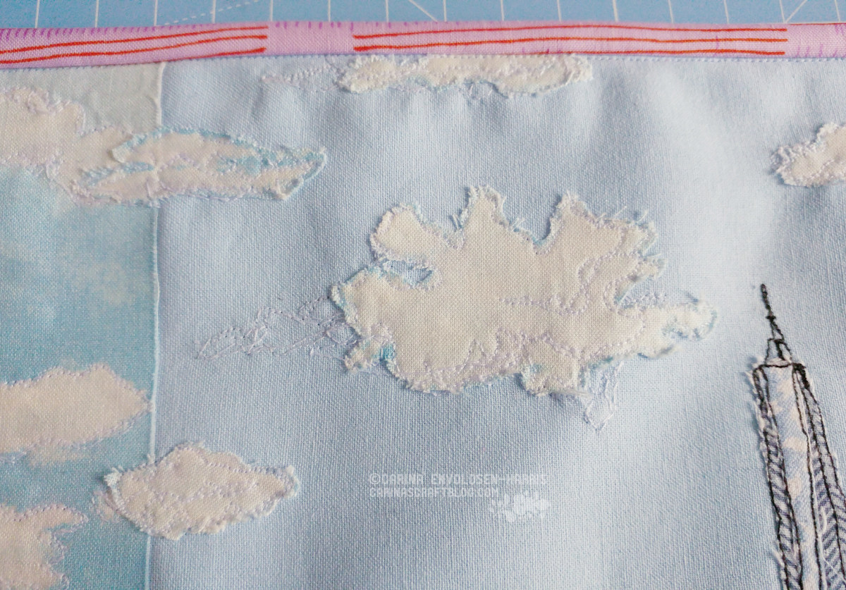
Like the water, I had trouble deciding what to do about the sky. It’s mainly just plain light blue fabric. I added the strip of cloud fabric because I thought it would make an interesting effect and break up the (potentially) monotonous sky.
At first I just machine embroidered the clouds on the plain fabric but it was almost invisible so I was at a bit of a loss for how to add clouds without distracting too much from the buildings.
So I’d put it aside for a couple of days and then one day I was tidying away fabrics I’d used in the project and I picked up the last little bit of the cloud fabric. I thought ‘maybe I can cut out the clouds and appliqué them..?’
I cut them out so they still had a bit blue around and then I did the machine embroidery on top and into the plain blue to sort of mix the colours together. I think it worked out ok! I especially like how the clouds are unraveling a bit at the edges, it makes them feel more cloud like. :-)
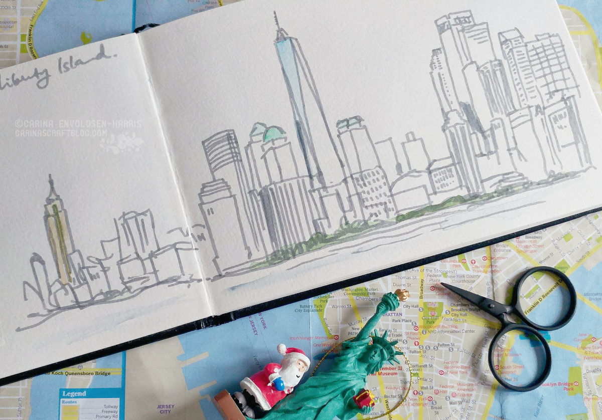
This is my original sketch. Very quick and very loose! It’s interesting to see it next to the appliqué picture.
And yes, we did buy a kitschy tourist souvenir. But just the one. It will be a nice addition to our Christmas tree. :-)